Data Quality Dashboard
Overview
Note
To understand the concept of Data Quality, you can read a full description in the Concept Overview page here.
The Data Quality Dashboard displays results over a selected time period for all enabled data metrics.
It provides a clear visual overview so you can quickly identify issues in your asset data streams allowing faster detection and resolution of potential data problems.
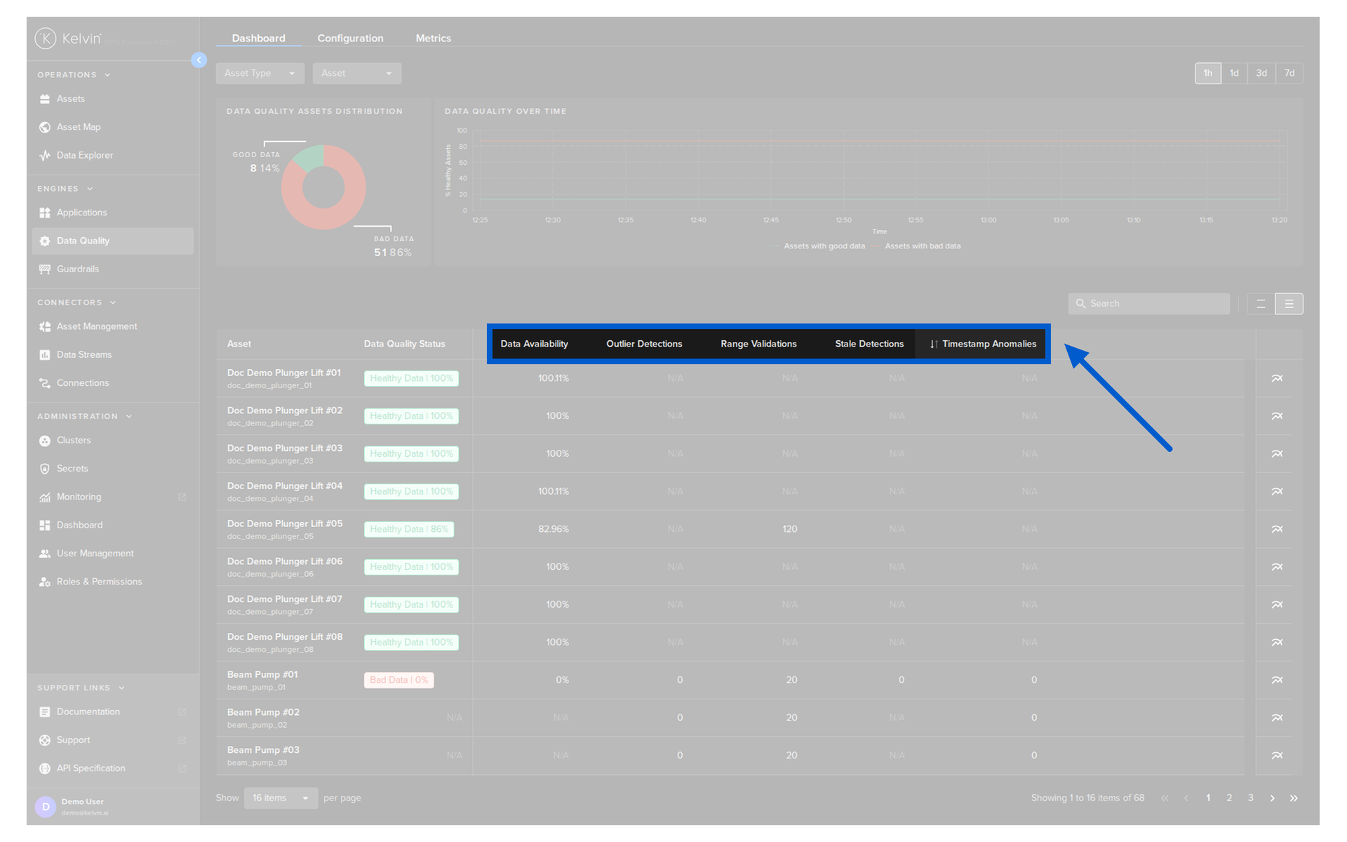
Five built-in metrics for Asset / Data Stream pairs can be enabled;
Note
Developers can also create their own Data Metric Applications.
- Data Availability
- Outlier Detection
- Range Validation
- Duplication Detection
- Timestamp Anomalies.
These checks report whether your data is accurate, consistent, and reliable.
Success
To understand what each metric is monitoring, hover your mouse over the column header and a popup will appear with its details.
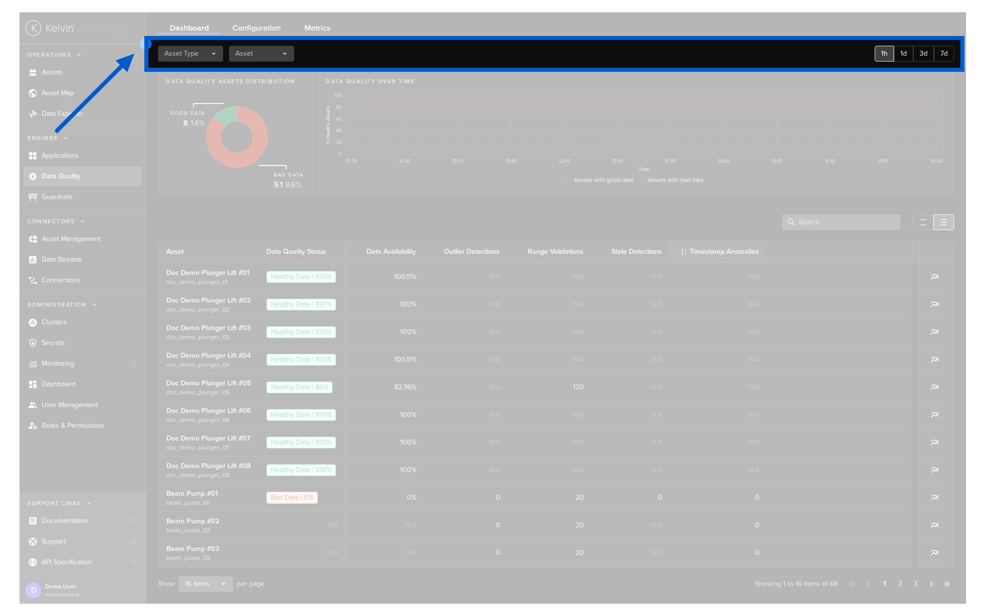
Filter
There are three filters that can be applied to both the statistics and Asset list sections;
| Filter | Description |
|---|---|
| Asset Type | Select one or more Asset Types. This will select all Assets that are linked to the Asset Type |
| Asset | Select one or more Assets |
| Time | Choose the time range for the statistics. Options are 1 hour, 1 day, 3 days and 7 days and are based on the current time. |
Statistics
The statistics shows the percentage of the good vs bad data on the Kelvin Platform and over time based on your filter conditions.
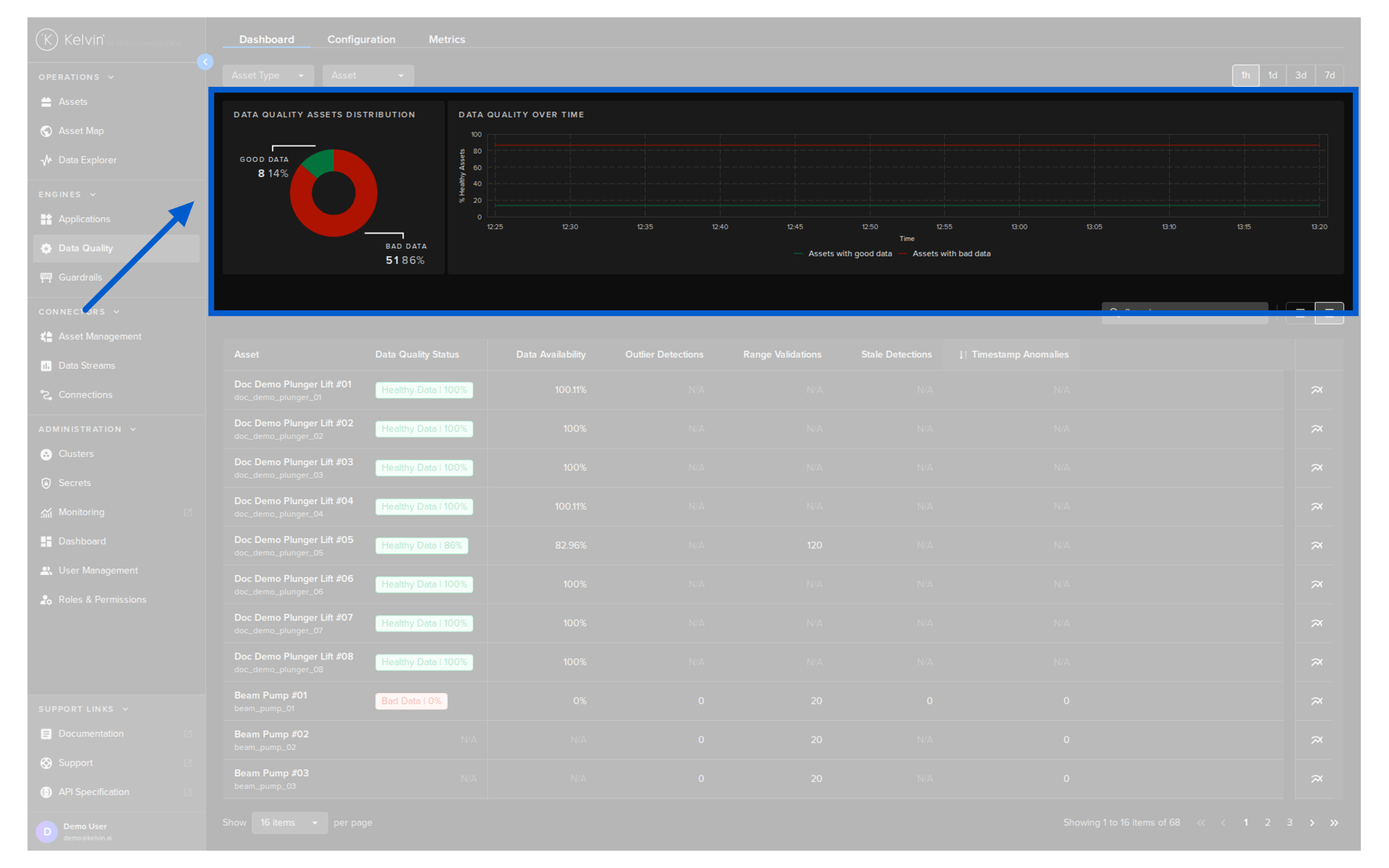
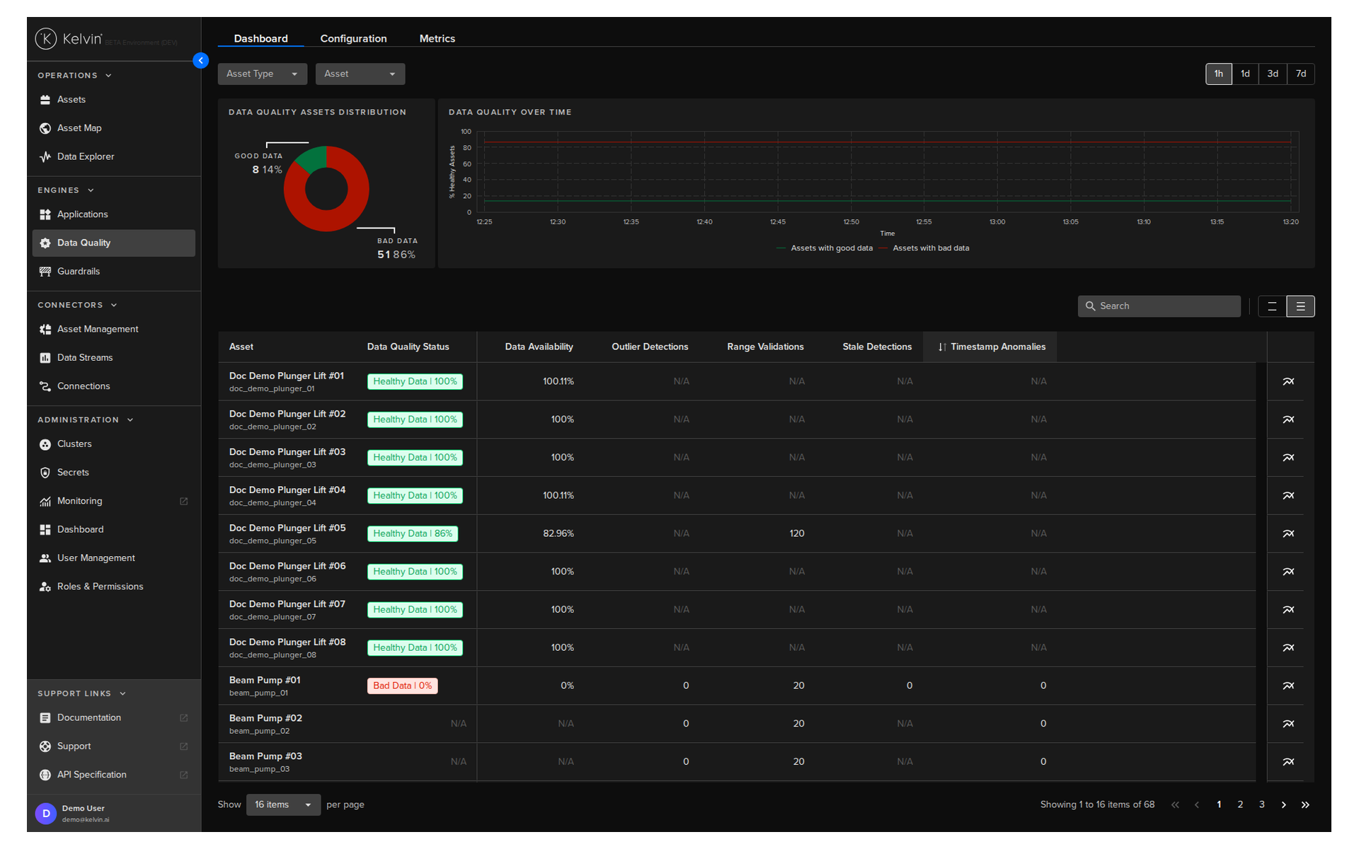
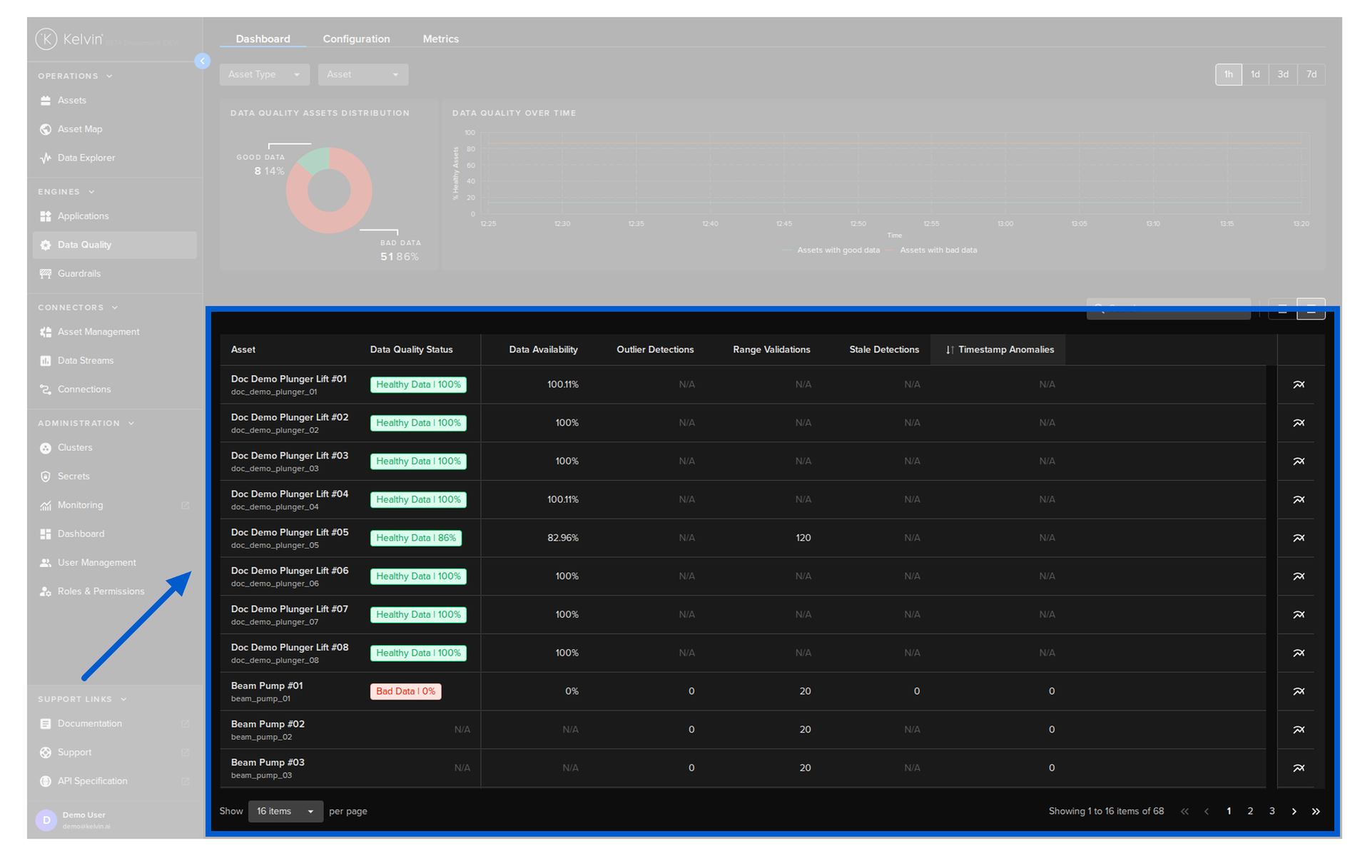
Asset List
The Asset list shows the Data Quality reports for each Asset.
Note
If the Asset / Data Stream pair is not enabled for a particular Data Metric, then you will see the N/A symbol.
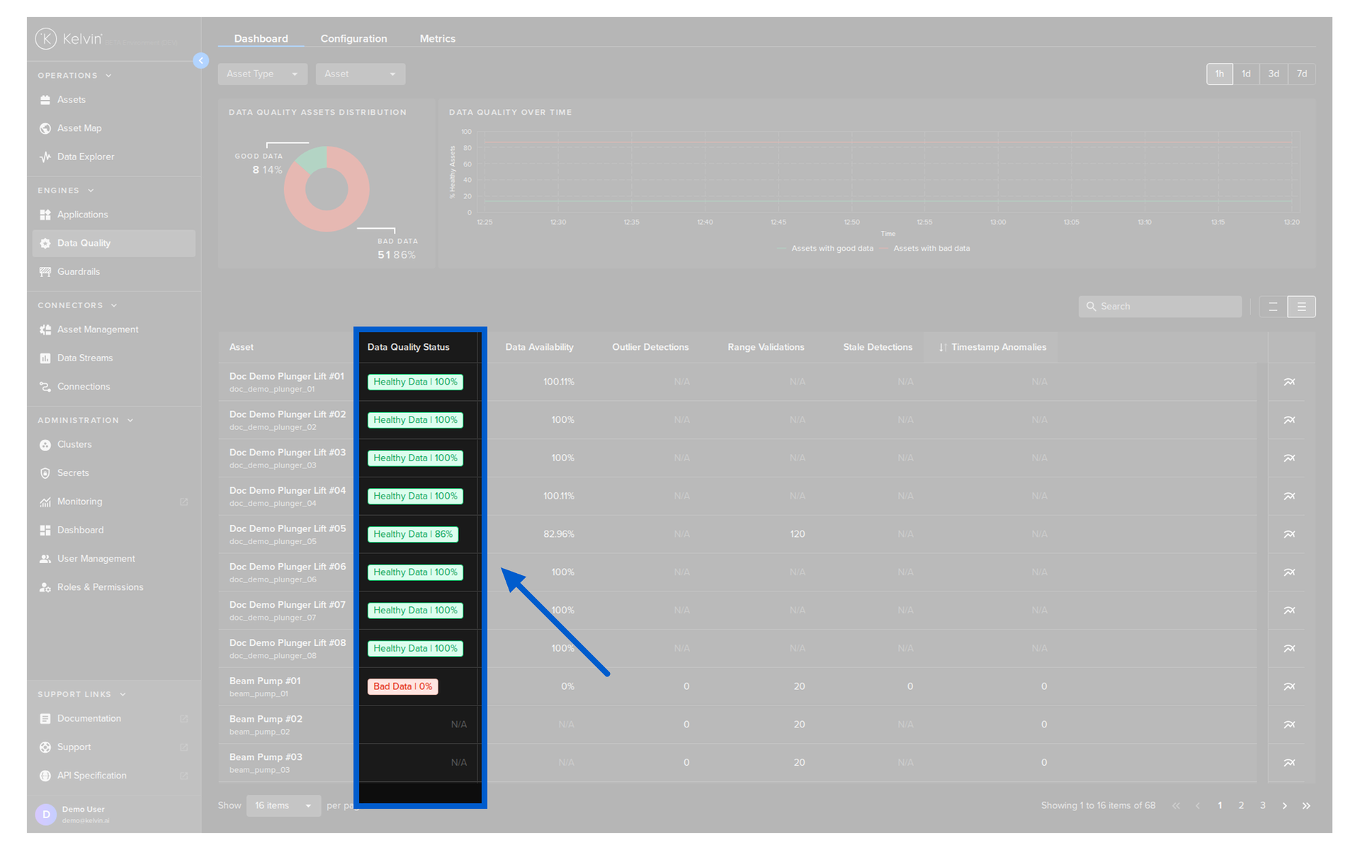
Data Quality Status
The Data Quality Status is calculated every 5 minutes based on all the metrics that are performed on each Asset.
This score is a percentage which is then compared to a cutoff point. Above the cutoff point means it is Healthy Data and below is Bad Data.
Note
The default cutoff point for data quality is 85%, indicating healthy data. This value can be adjusted by Developers or Platform Administrators through the Kelvin API.
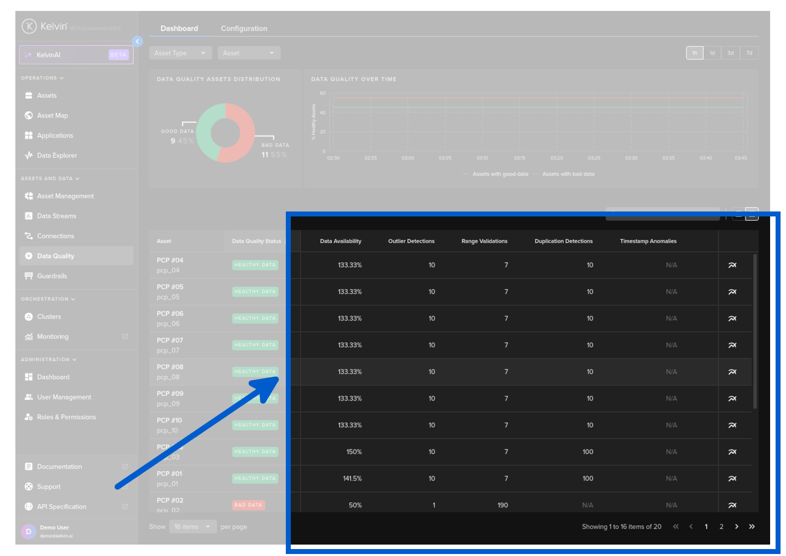
Data Quality Metrics
Each Data Quality metric runs specific algorithms to check the quality of the Data and the results are recorded as a new Data Stream on the Kelvin Platform in a special category.
Note
Each metric can produce a different output format, such as a percentage, a count of data readings, or another format.
You can read in the Concept Overview here a full description on the in-built Data Quality metrics.
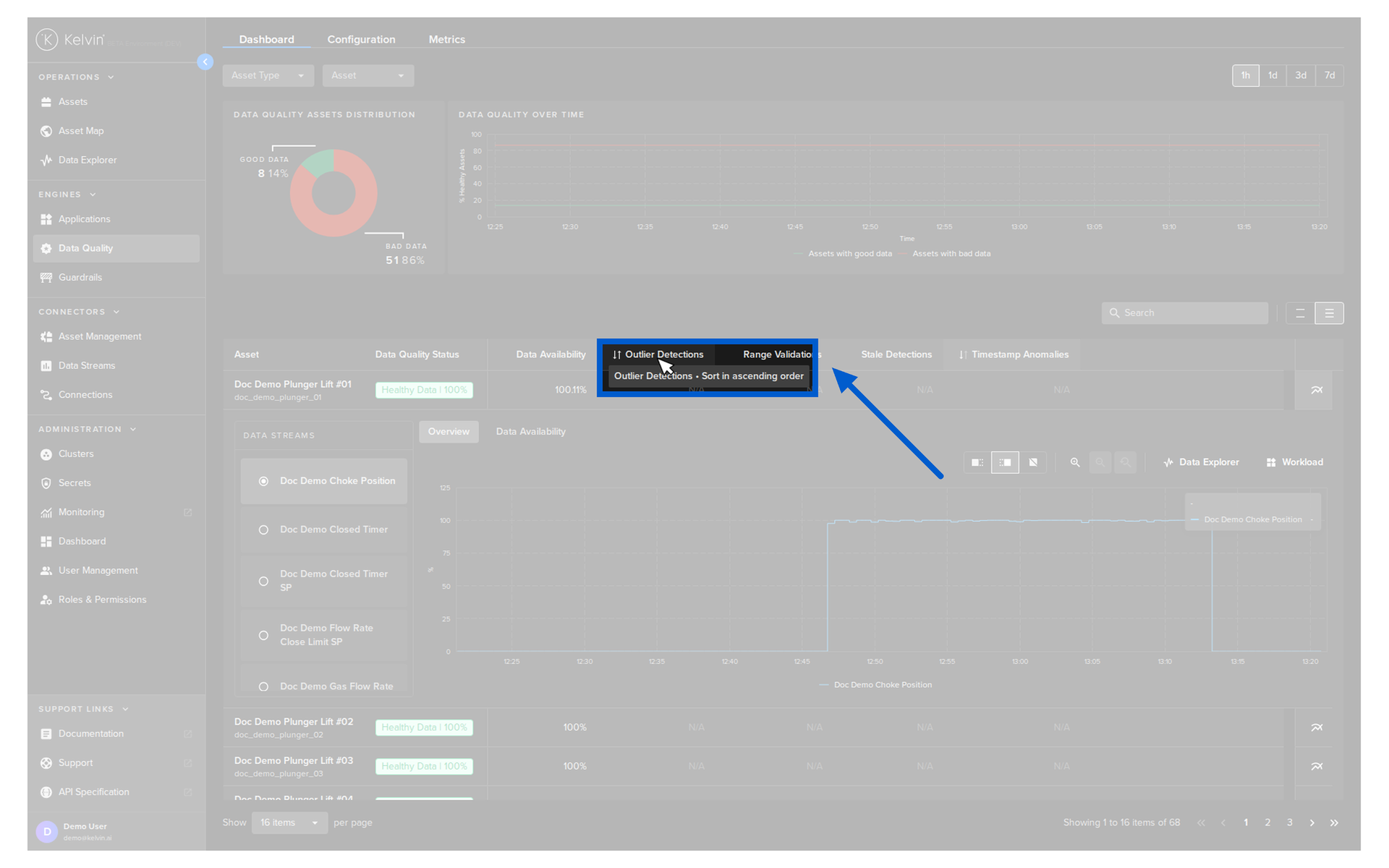
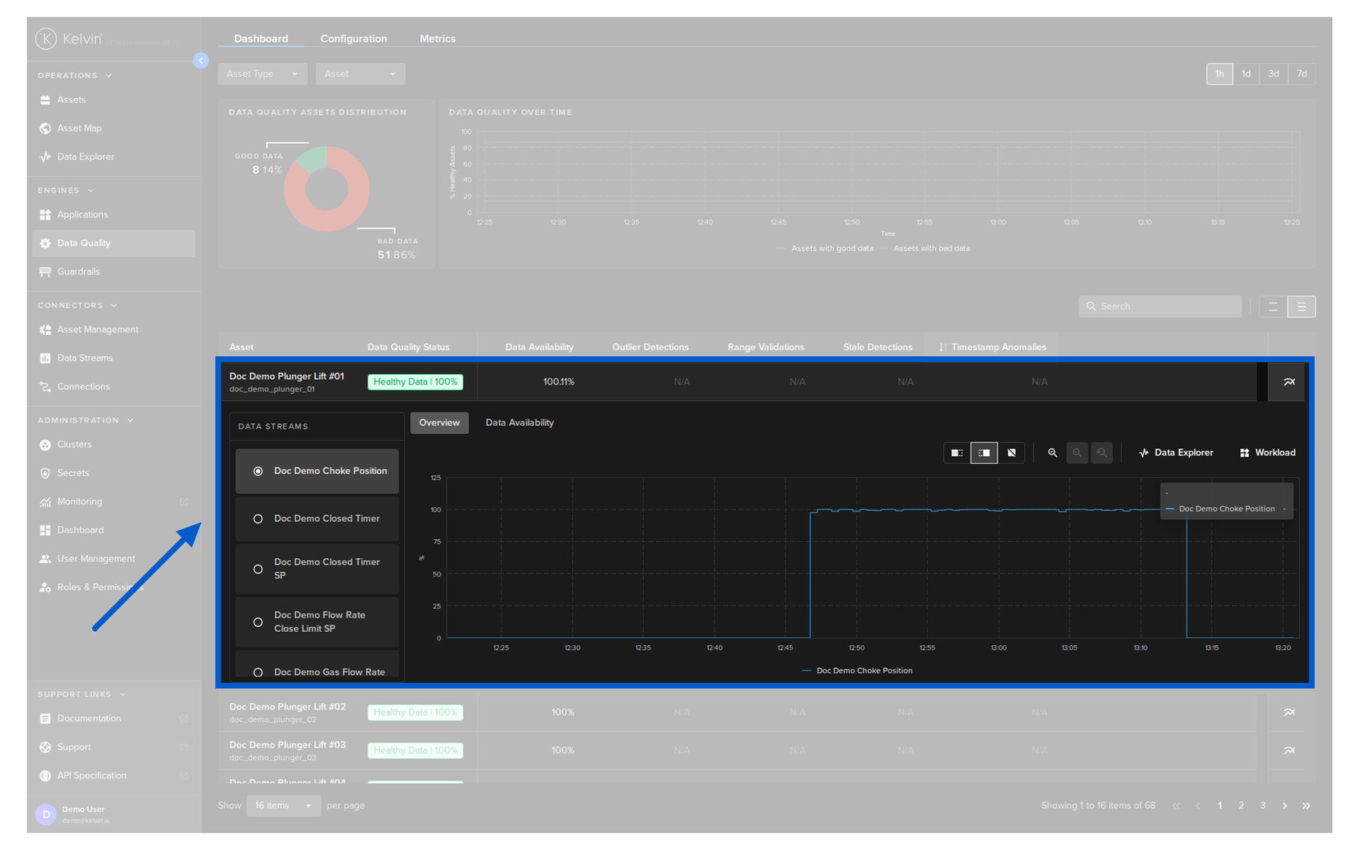
Asset / Data Stream Details
If you click on the analytics icon ![]() for an Asset;
for an Asset;
![]()
You can then select a Data Stream to view detailed metric results displayed on a timeseries graph.
Success
In the Data Stream list on the left, if you click on the provided link, this will take you to the Clusters section and show you the logs for the specific Connection workload that is collecting the data from the Asset.
Note
If you see a bad data tag, this is a compilation of any Data Quality metics in any Data Streams.
To find the actual alert location, you will need to scroll through the Data Streams on the left to find the Data Quality alert.
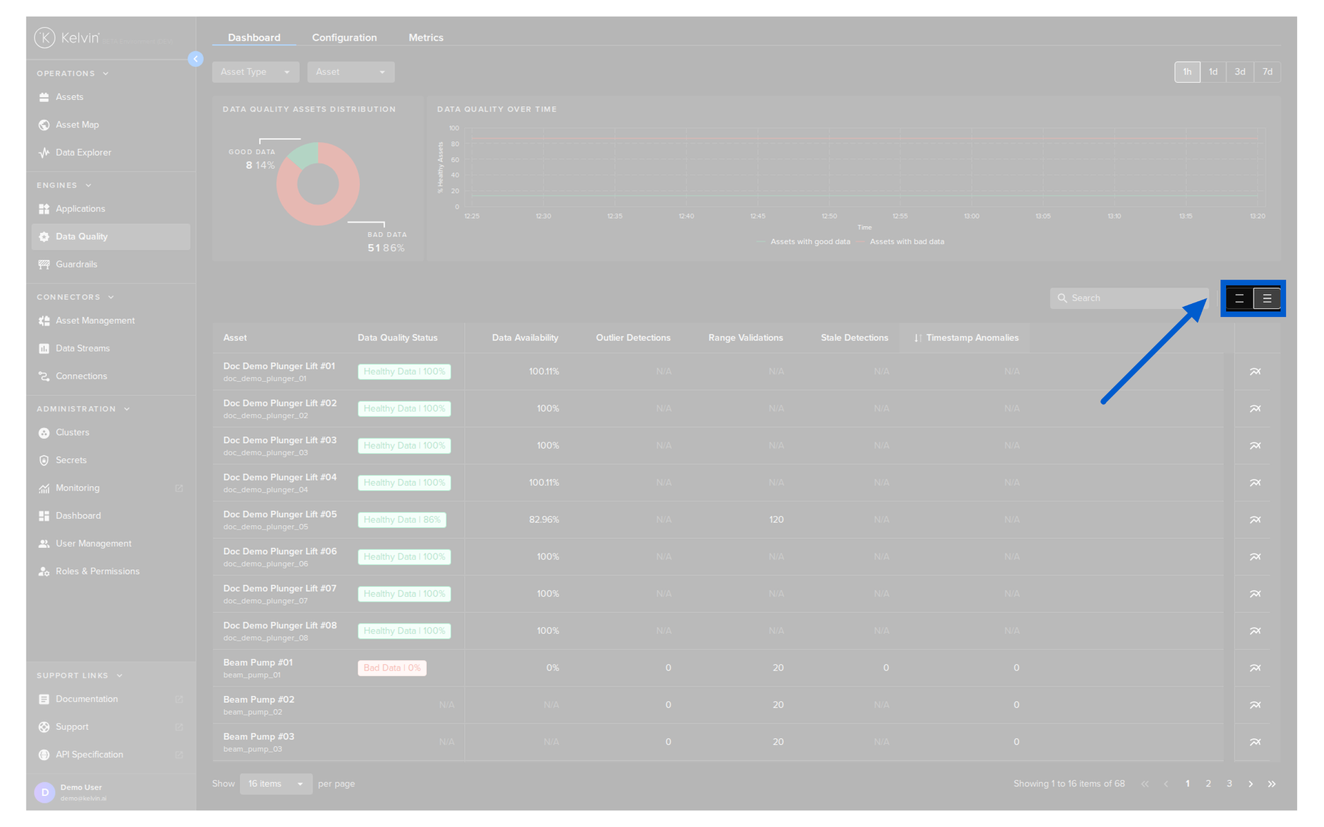
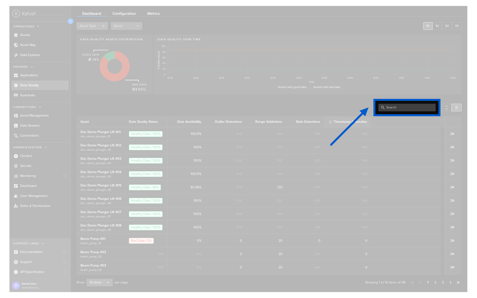
List Options
The list can be filtered and sorted to help you quickly locate assets of interest.
Note
These actions do not affect the statistics displayed.
Sort Order
Like other table lists in the Kelvin UI you can sort the list on one column. Simply click on the column to choose ascending, descending or not sorted.
Search
You can also filter and search the list for specific Assets.
Row Spacing
To fit more or less rows on the screen you can choose the spacing of the rows.