240: Exploring the Kelvin UI
This course gives you a guided tour of the Kelvin UI.
By the end, you will be comfortable with the layout, know where things are, and understand the key areas you will be working in day to day.
Video Tutorial
You can choose to watch the video walkthrough of this tutorial, or continue below to follow the step-by-step written guide.
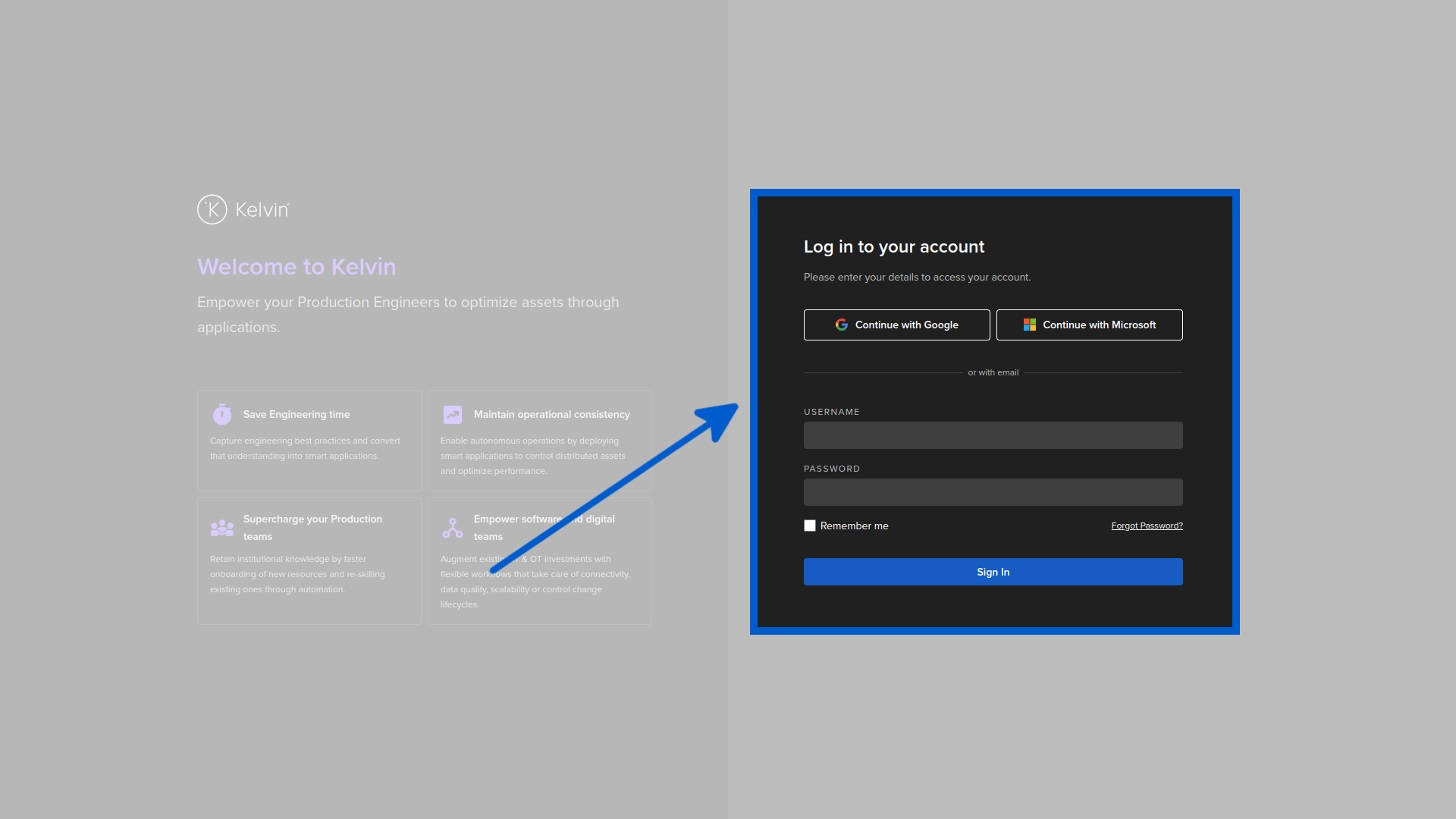
Logging In
You can log into the Kelvin UI through any modern browser. You will either use a username and password, or if your company has single sign-on (SSO) configured, you can use that instead.
Browser Support
The Kelvin UI is fully tested on the latest version of Google Chrome. For a seamless experience, always use the latest Chrome version.
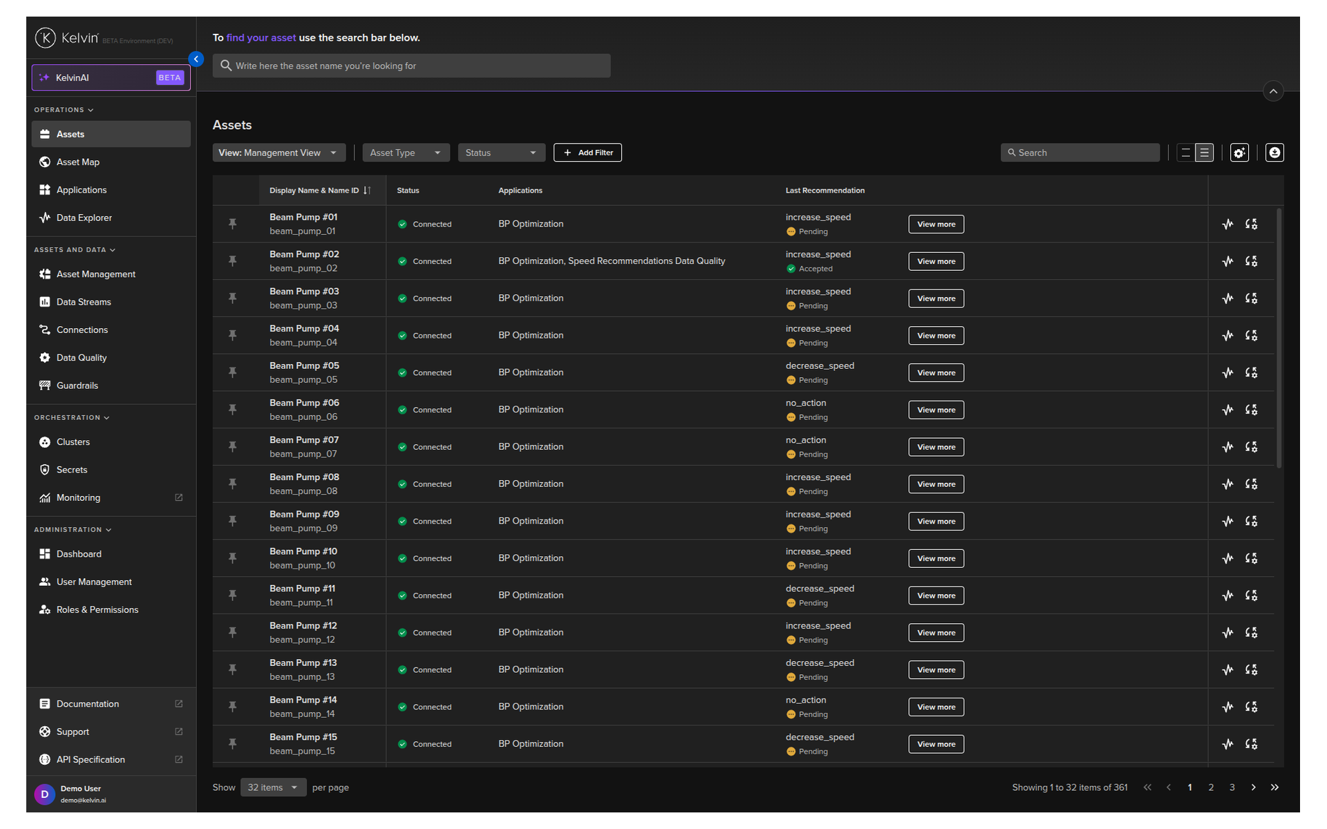
Once you log in, the very first screen you arrive at is the Assets page — what we call the Table View. This is your home base.
The Table View — Your Landing Page
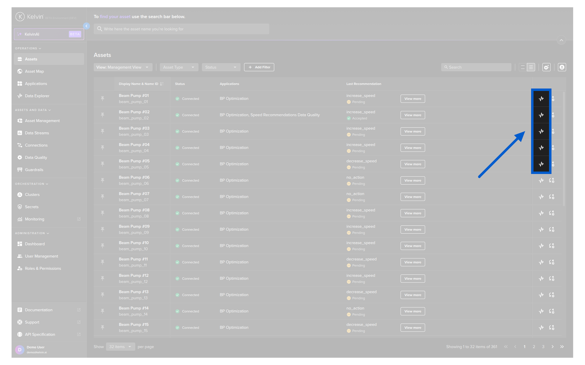
The Table View is where you will spend most of your time. It shows all the assets you are responsible for in a single, customizable table.
At the top of the screen, you have a search bar where you can quickly look up any asset by name. You can also collapse the search bar to free up additional screen space.
Below that, you see the list of your assets with several columns of information:
- Asset name — the name of each asset
- Status — the current state of the asset (Online, Offline, etc.)
- Applications — which SmartApps are running on the asset
- Asset Type — the category of the asset
These are just the default columns. You can add, remove, and rearrange columns to show exactly what matters to you — and we will walk through that shortly.
The Sidebar — Your Navigation
Running along the left side of the screen is the navigation sidebar. It is organized into sections, and where you spend your time depends on your role.
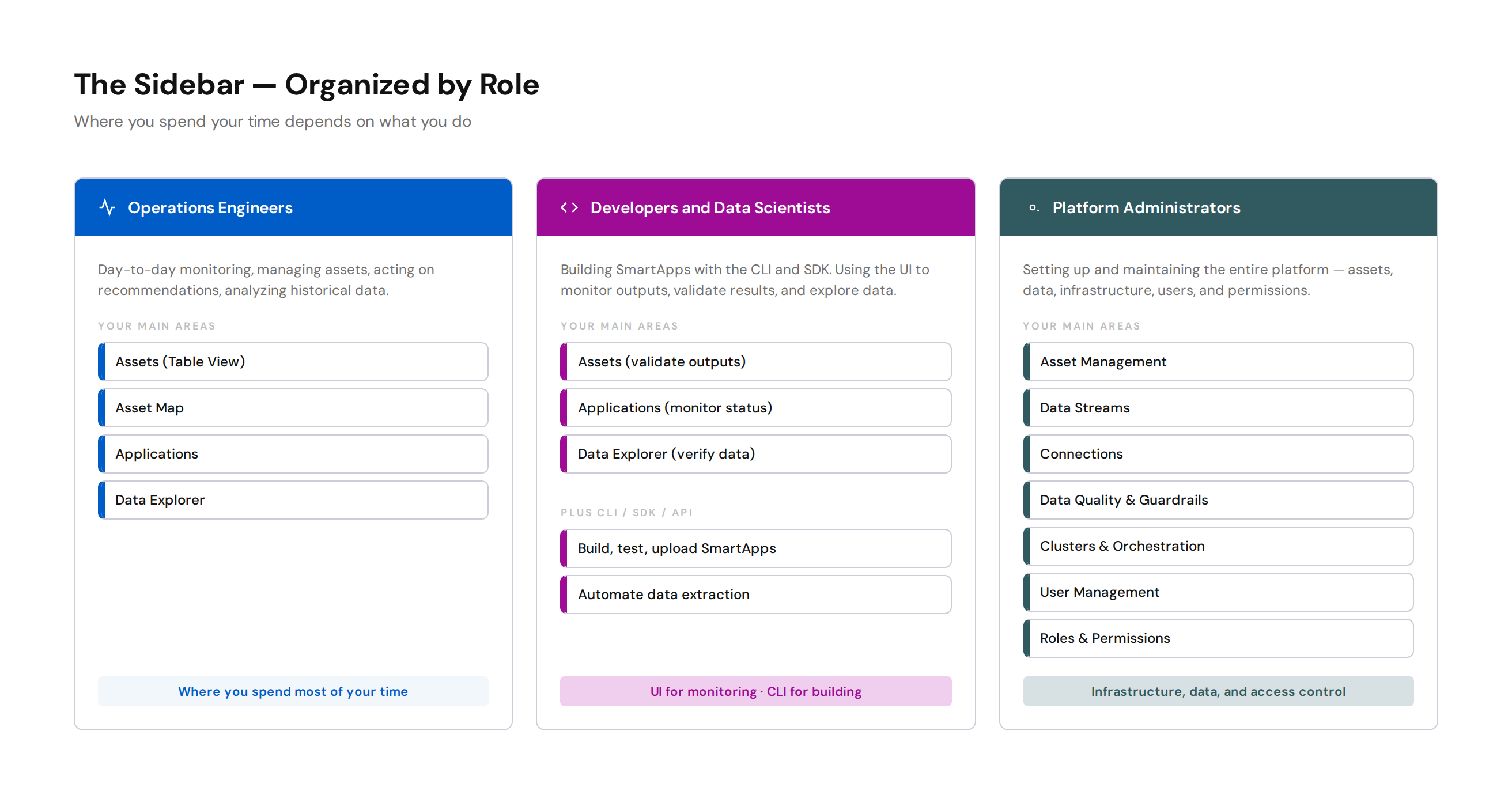
Operations Engineers
You will spend most of your time in the top section of the sidebar:
- Assets — the Table View you landed on. Your main workspace.
- Asset Map — see your assets plotted on a geographic map
- Applications — manage SmartApps and see what they are doing
- Data Explorer — dig into historical data with interactive charts
Platform Administrators
You will work across the infrastructure, data, and administration sections:
- Asset Management — create and manage assets
- Data Streams — configure the data coming into the platform
- Connections — set up and manage data source connections
- Data Quality and Guardrails — ensure data reliability and safe writes
- Clusters — manage edge infrastructure
- User Management — manage accounts and access
- Roles & Permissions — configure who can do what
Developers and Data Scientists
You will use the UI for monitoring and validation, but your main tools are the CLI and SDK:
- Assets — validate that your SmartApps are producing correct outputs
- Applications — monitor SmartApp status and logs
- Data Explorer — verify data and review control change history
For this course, we are going to focus on the top section — the areas that Operations Engineers use day to day.
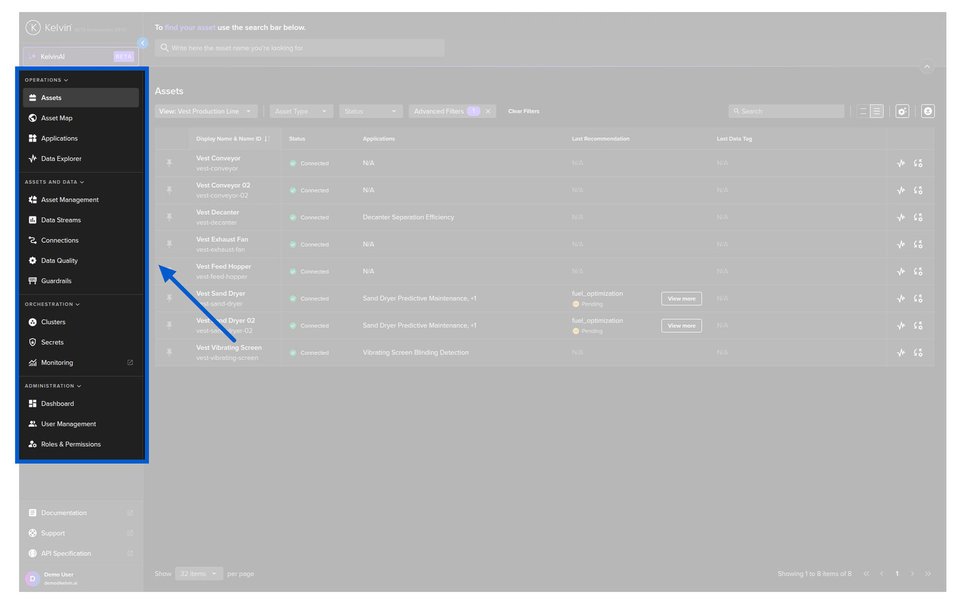
Customizing Your Columns
The default table shows basic information, but the real power is in customization. You can add columns that show live data, recommendations, parameters, and more — turning the table into a real-time dashboard tailored to your workflow.
How to Add a Column
- Click the gear icon (column settings) in the table header
- You will see the different column types available to add
- Select the type you want
The available column types are:
| Column Type | What It Shows |
|---|---|
| Data Stream | Live sensor readings from any data stream on the asset |
| Recommendation | Latest recommendation with a quick action button |
| Custom Action | Latest custom action status |
| Asset Property | Static properties like location, well type, or model |
| App Parameter | Current SmartApp configuration values |
| Schedule | Upcoming scheduled parameter changes |
| Data Tag | Latest data quality or event tag |
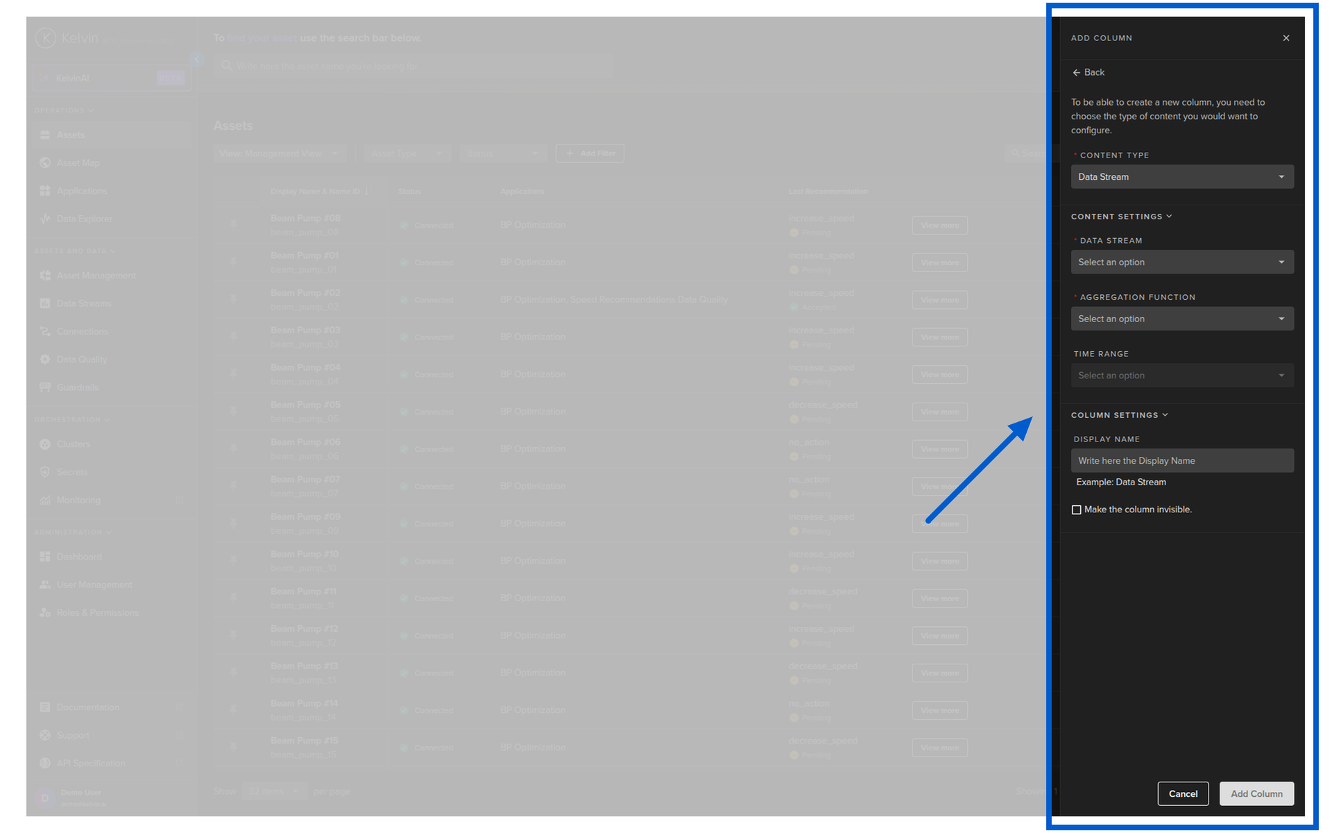
Example — Adding a Data Stream Column
Let's say you want to see the casing flow rate for all your wells directly in the table.
- Click the gear icon to open column settings
- Select Data Stream as the column type
- Search for the data stream you want — e.g., "Casing Flow Rate"
- Choose what value to display — Last Value is the most recent reading, but you can also choose averages or other aggregations
- Give the column a name — e.g., "Casing Flow" — this is what shows as the column header
- Click add
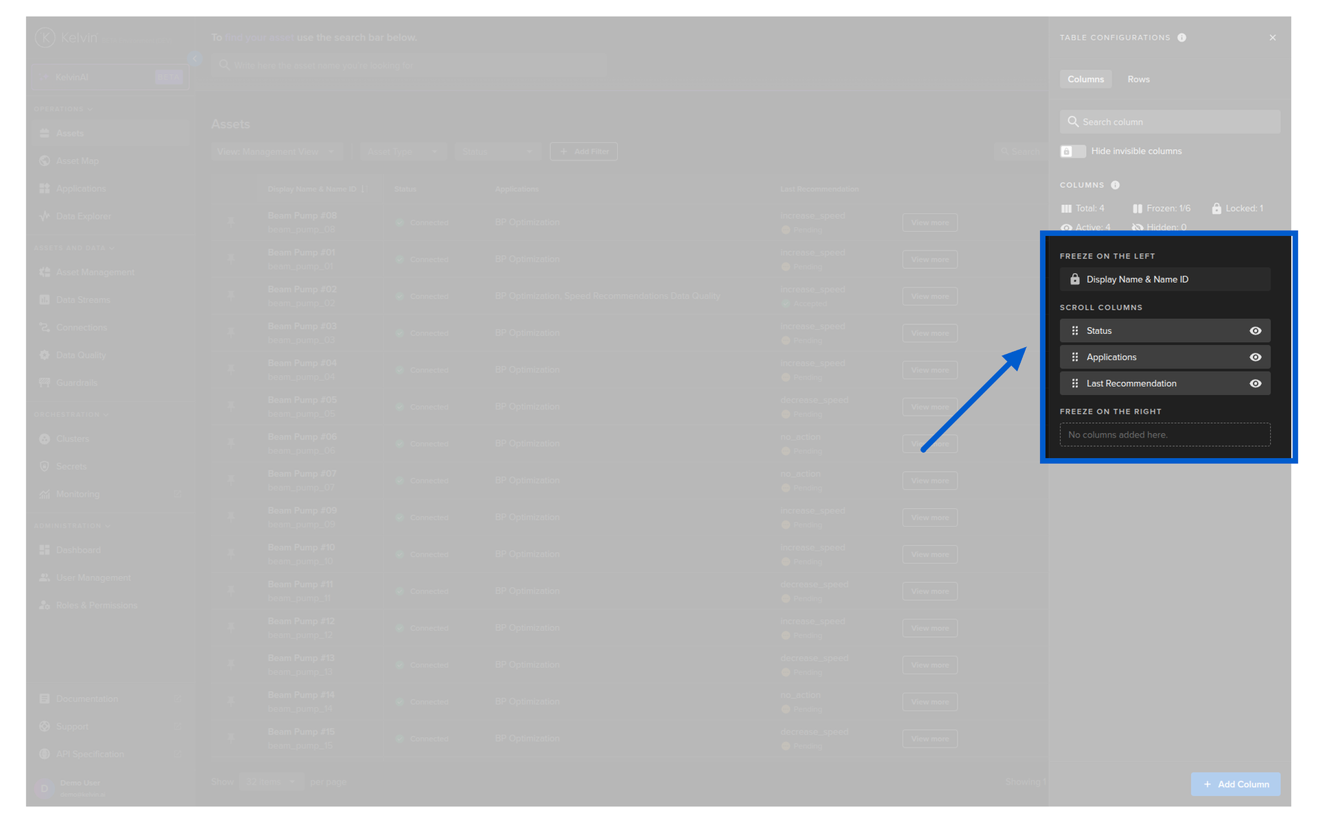
The column appears immediately. You can then drag it to reposition it in the order that makes most sense for your workflow.
Column Names
Give your columns short, clear names. They show as headers in the table, so "Casing Flow" is better than "Casing Flow Rate Last Value Measurement". Your team should recognize them at a glance.
Clicking on an Asset
When you click on any asset in the table, it expands to show the asset detail view. This is where you see everything about that specific asset in one place.
What You See
The asset detail view is organized into sections:
- Recommendations — a list of all recommendations that have been generated for this asset. You can review the evidence, see the suggested actions, and accept or reject directly from here.
- Parameters — the SmartApp configuration values for this asset. These are the tuning knobs that control how the application behaves for this specific asset.
- Evidence — supporting data and visualizations that the SmartApp has attached to its recommendations. This can include charts, text, images, and embedded Data Explorer views.
- Application tabs — one tab per deployed application, so you can quickly switch between apps running on this asset.
- Manual Controls — view live data stream values and manually change setpoints when needed.
All of these sections can be configured to present whatever information is most helpful for your decision-making.
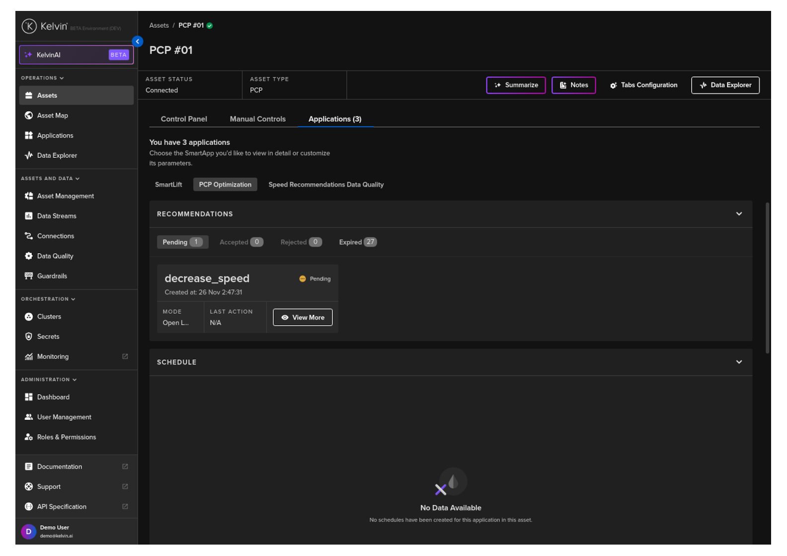
Recommendations
When you see a pending recommendation, you can review the evidence, see what actions will be taken, and then accept or reject it. You can also leave comments — these are visible to developers and help them improve the SmartApp over time. See Course 241 for a deep dive on recommendations.
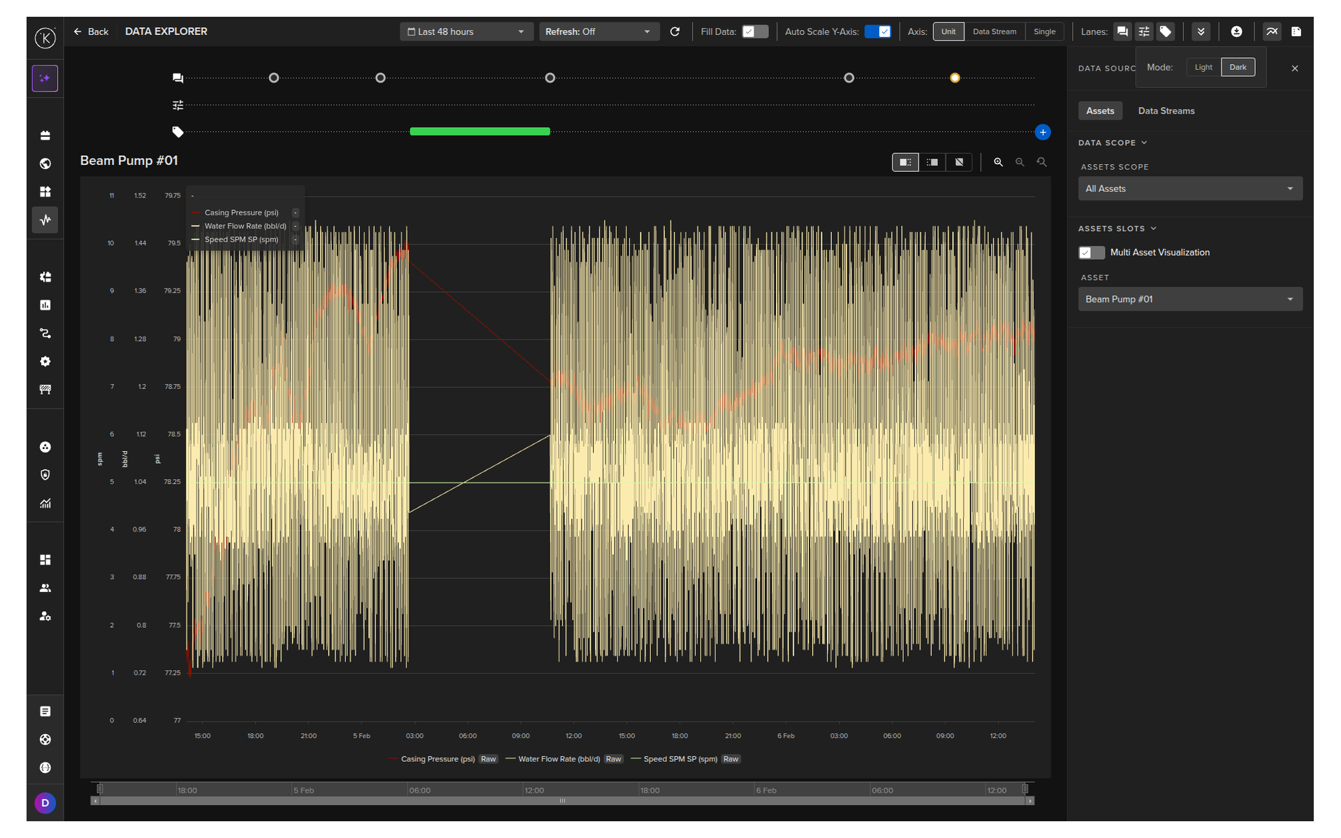
The Data Explorer
From any asset, you can jump to the Data Explorer — the analytical tool for understanding what is happening over time.
The Data Explorer shows interactive charts of your asset's historical data with powerful features built for industrial operations:
- Control change markers — see exactly when setpoint changes were made
- Recommendation markers — see when recommendations were created, accepted, or rejected
- Multiple assets — compare data side by side
- Multi-chart — display up to four charts simultaneously
- Flexible Y-axis — single shared axis, one per unit type, or one per data stream
We will have a dedicated course on the Data Explorer that covers all its features in detail.
Quick Quiz
1. What is the first screen you see when you log into the Kelvin UI?
Answer: The Assets page (Table View). It shows all your assets in a customizable table.
2. Where is the navigation sidebar, and how is it organized?
Answer: The sidebar runs along the left side of the screen. It is organized into sections by function: Operations (top), Assets and Data, Orchestration, and Administration (bottom). Where you spend your time depends on your role.
3. What column types can you add to the asset table?
Answer: Seven types:
- Data Stream (live sensor values)
- Recommendation (latest recommendation with action button)
- Custom Action (latest custom action status)
- Asset Property (static properties like location or well type)
- App Parameter (SmartApp configuration values)
- Schedule (upcoming parameter changes)
- Data Tag (quality or event flags)
4. When adding a Data Stream column, what display options do you have?
Answer: You can choose Last Value (most recent reading) or other aggregations such as averages. You also give the column a custom name that appears as the header.
5. What happens when you click on an asset in the table?
Answer: The asset detail view expands, showing recommendations, parameters, evidence, application tabs, and manual controls for that specific asset.
6. What are the three main areas in the sidebar that Operations Engineers use most?
Answer: Assets (the Table View), Applications (managing SmartApps), and Data Explorer (historical data analysis). The Asset Map is also available for geographic views.
7. Can you rearrange columns after adding them?
Answer: Yes. You can drag columns to reposition them in any order. You can also freeze columns left or right so they stay visible when scrolling horizontally.
Summary
You have now had a guided tour of the Kelvin UI. The key things to remember:
- The Assets page (Table View) is your home base — you land here when you log in
- The sidebar organizes everything by function — Operations at the top, Administration at the bottom
- You can customize columns to show live data streams, recommendations, parameters, and more
- Clicking an asset opens the detail view with recommendations, evidence, parameters, and manual controls
- The Data Explorer gives you interactive historical charts with control change and recommendation markers
- Everything is persistent — your column setup, filters, and views are remembered between sessions
Good luck and Happy Learning !